The Problem
The Challenge
Shuttle bus service during subway disruptions is one of the MTA's most visible public failures, not because shuttle buses don't work, but because riders don't trust them. No consistent identity. No connection to the line they already know. No reason to believe the shuttle goes where the train was supposed to go.
The G Train shutdown was 30 days away. We needed a solution that could be implemented fast, with existing infrastructure, and with zero budget for new signage construction.
- No consistent visual identity connected the shuttle to the G Train line
- No integration with existing MTA digital mapping or wayfinding systems
- 30-day implementation window, no time for new hardware or printed signage runs
- Solution had to work with existing physical signs and the MTA Bus Tracker app
The Insight
Riders Already Know the G. Build on That.
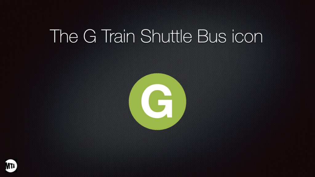
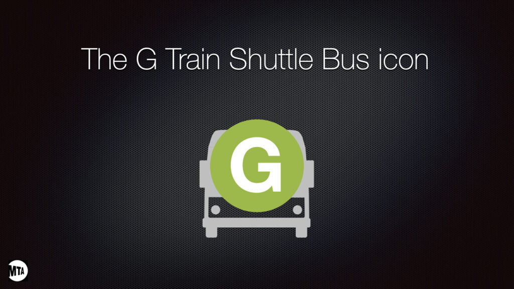
The core design insight: riders trust the subway line because they've learned it. The green circle with the G is already in their mental map. The solution was to build the shuttle identity directly on top of what riders already recognize, the G Train's own line color and letter, and extend it with a bus icon that communicates the mode change without losing the line identity.
This approach also solved the scalability problem in one move. The same system, line color + mode icon, works for any MTA line facing disruption. One design standard. Network-wide application. Quick, low-cost deployment using vinyl graphics on existing signage.
The brand system concept, built on the G Train's existing line identity for instant rider recognition.
Why This Works at Scale
Scalability Is the Design.
This isn't just a G Train solution. It's a system. The brand logic, line color + bus icon, works for every MTA line facing service disruption. Swap the letter, swap the color, keep the structure. Riders immediately recognize it as their line with a mode change. That's the entire message.
Critically, the system deploys using simple vinyl graphics on existing signage infrastructure, no new hardware, no major print runs, no construction. That dramatically cuts implementation costs while maintaining design uniformity across the entire subway system. A design decision that's also a fiscal decision.
- Works for every MTA line, letter and color swap, system stays the same
- Deploys via vinyl overlay on existing signage, fast, low-cost, no construction
- Riders recognize their line instantly, understand the mode change intuitively
- Consistent with existing MTA physical wayfinding and digital mapping systems
- Bus Tracker integration, real-time visibility builds the trust that makes the shuttle actually usable
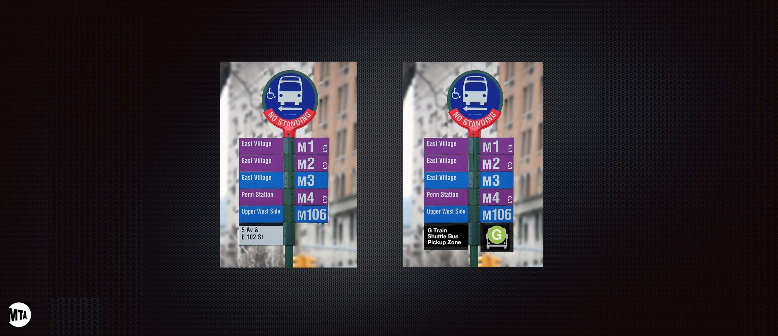
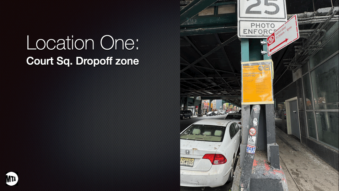
Before and after, the same signage infrastructure, transformed using simple vinyl overlays. Fast to deploy, immediately recognizable.
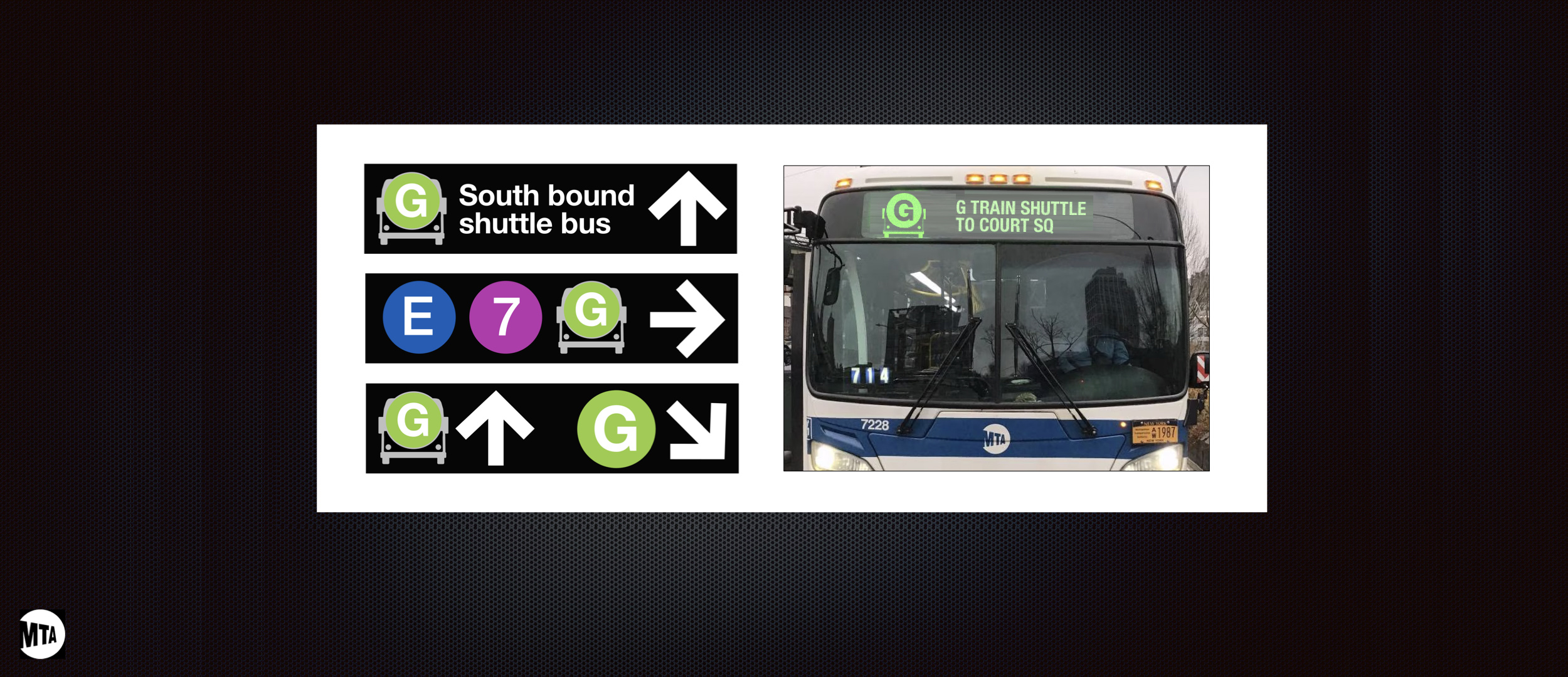
Signage in the real environment, vinyl overlay on existing infrastructure. Fast to deploy, immediately recognizable.
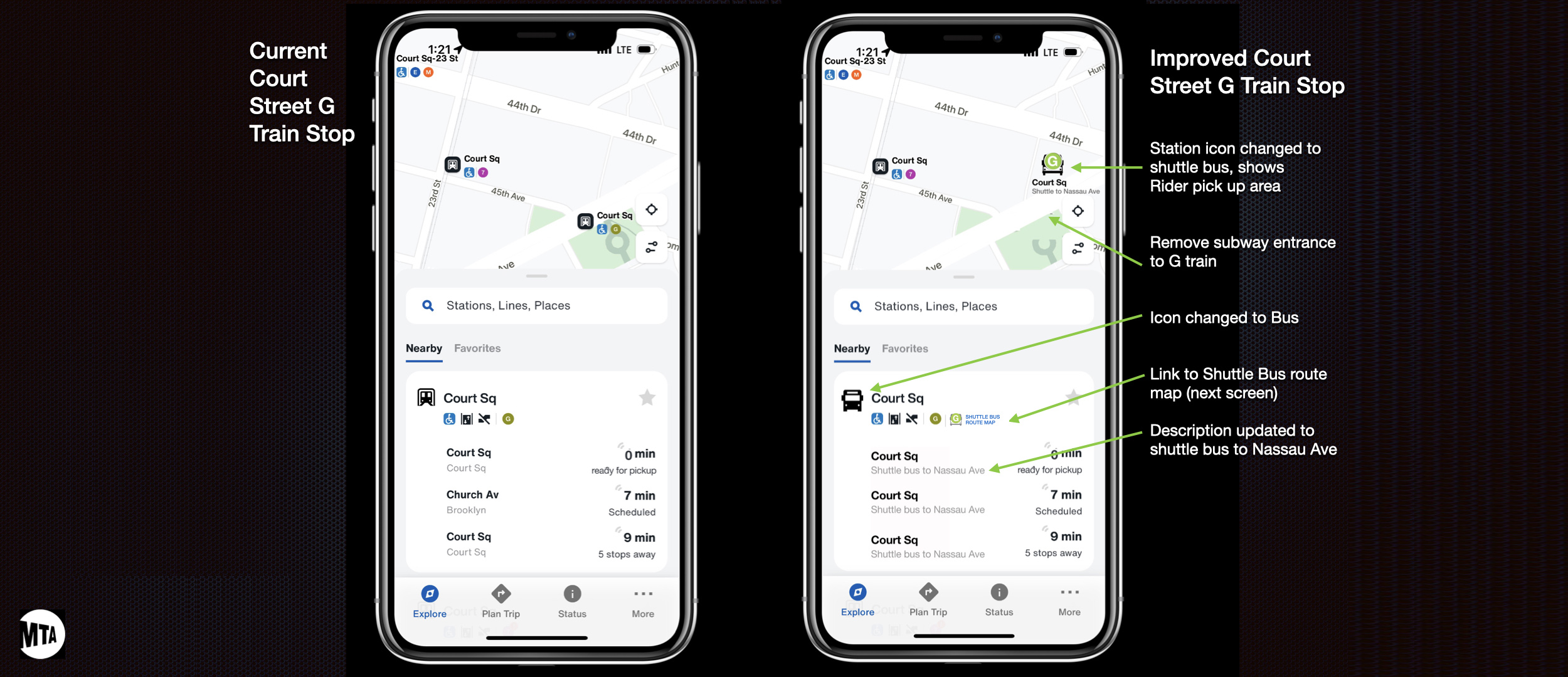
App integration, the shuttle brand extends into the MTA Bus Tracker, giving riders real-time visibility and building trust in the service.
Above & Below Ground
The Complete Rider Journey
The brand system covers the full rider journey, from underground platform to street level. Both maps use the same visual language, making the transition from subway to shuttle seamless regardless of where a rider enters the system.
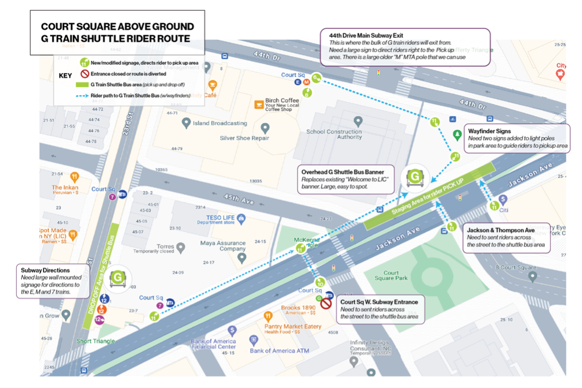
Above-ground map, shuttle route using consistent brand language with the G Train system.
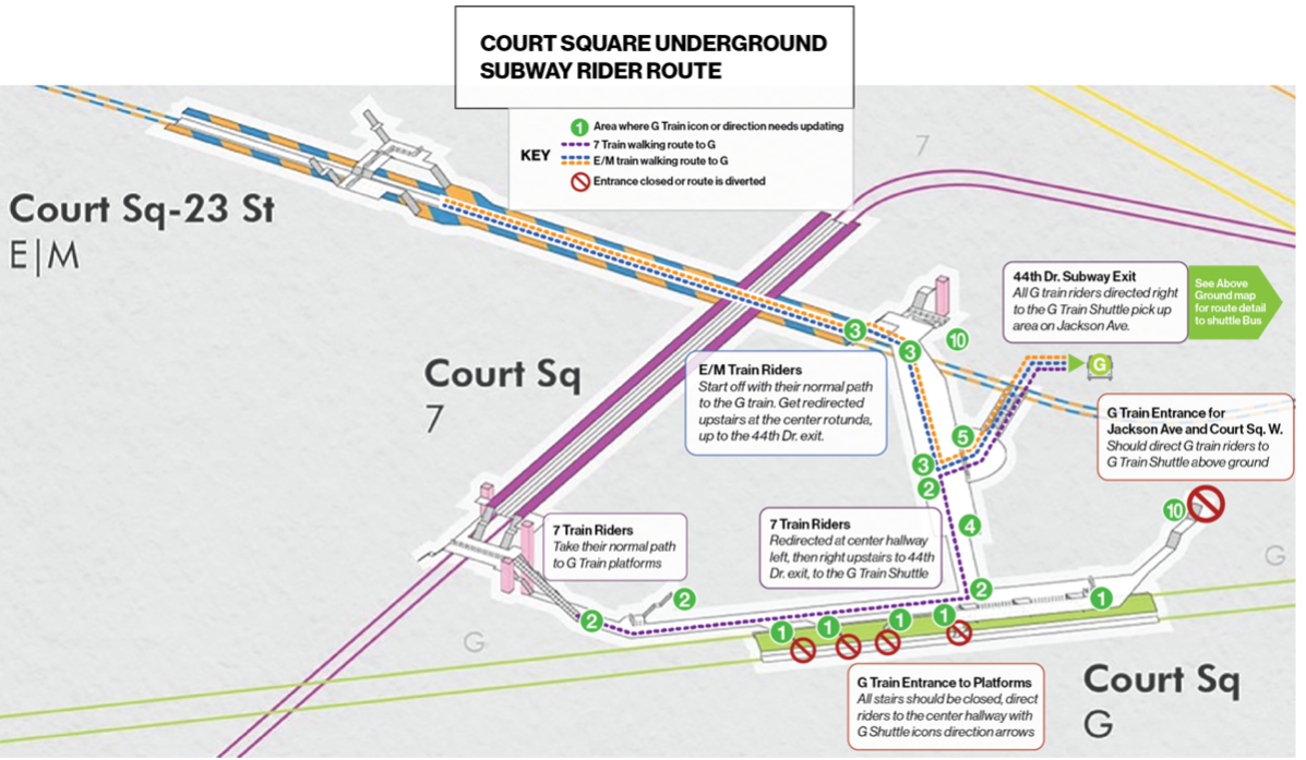
Underground map, same brand, different context. Riders move between both without losing orientation.
Animated Wayfinding
Station-Level Guidance in Motion
Animated wayfinding at key transfer stations gives riders real-time directional confidence, exactly when and where they need it most.
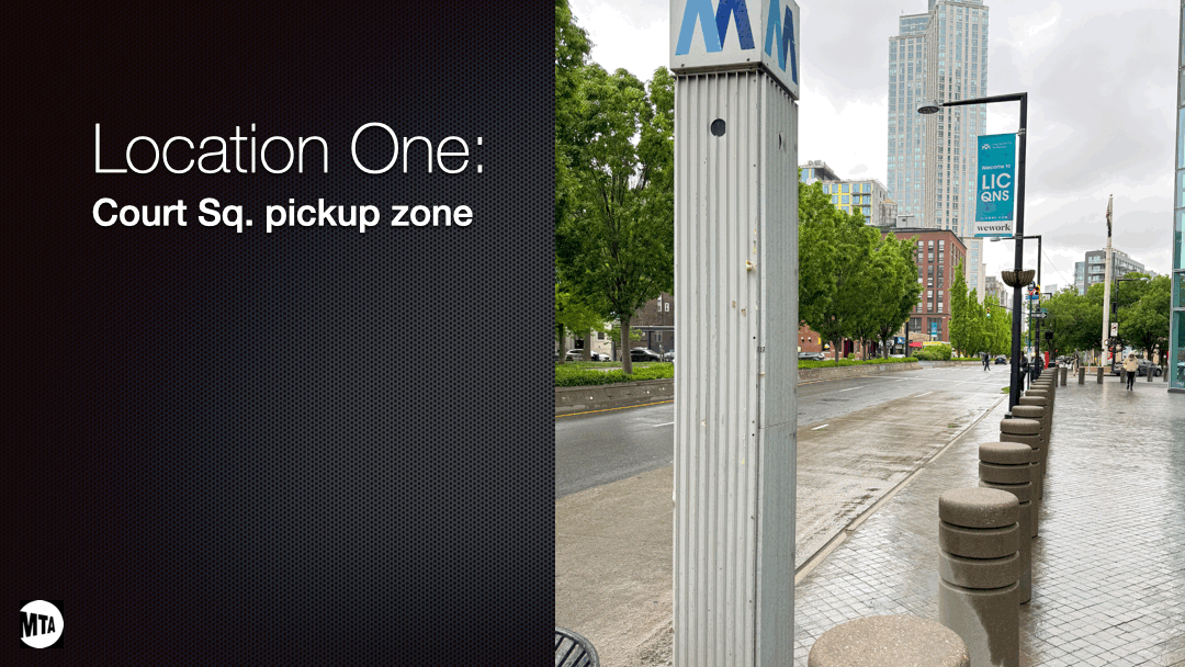
Court St station, animated wayfinding directing riders from platform to shuttle pickup.
Court St pickup, animated guidance to the exact boarding location.
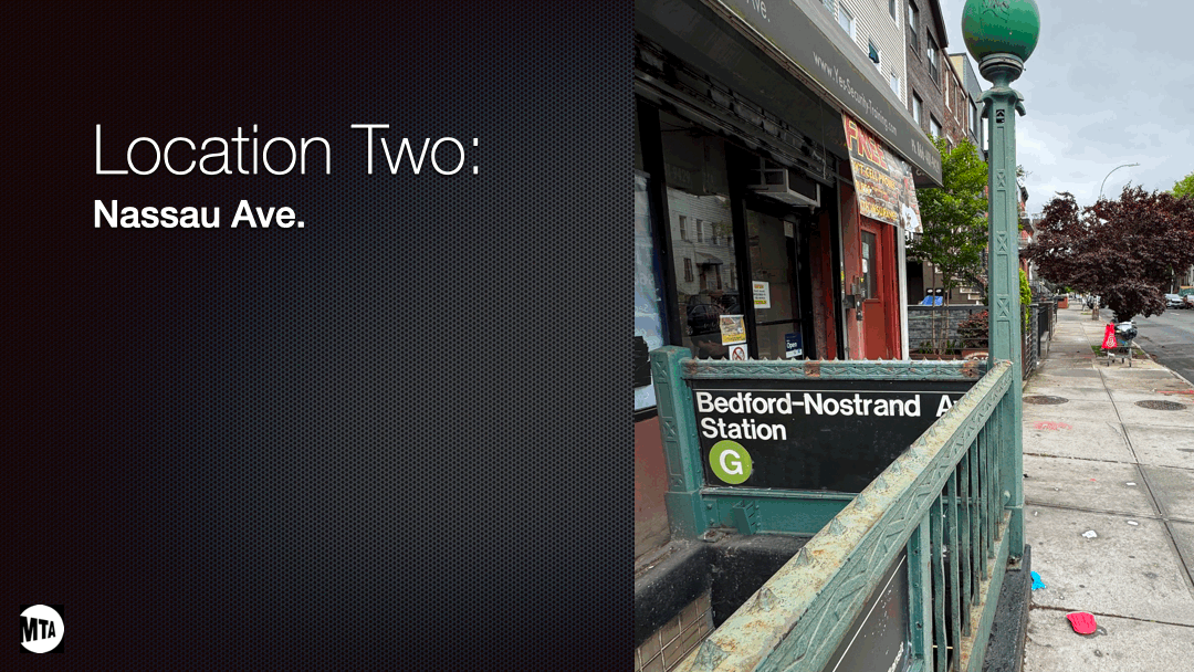
Nassau St pickup, the same system, a different station.
Content
Wayfinding That Works on the Move
Wrote all signage, app, and wayfinding copy. Transit communication is read in motion, often by people in a hurry, in environments full of competing visual noise. Every word had to be unmistakable at a glance, and every instruction had to survive translation across the MTA, LIRR, and Metro North.
A brand system designed for one line, built to serve the entire MTA network. Fast to deploy, low-cost to implement, and instantly legible to any rider who already knows their train.