Improving Rider Experience with digital & physical UX
Metropolitan Transportation Authority
My team was approached by MTA executive management to develop a major rapid design solution for the upcoming G train shuttle project. Shuttle bus service replaces subway lines when major long-term track work is needed; using a new bus line to replicate the stops of a particular train. Unfortunately, the current shuttle bus system is not well implemented, resulting in very low ridership and poor feedback from the public. My job was to develop a better overall user experience for riders.
My roles in the project:
Strategy/concept, Analysis, Brand Design, App concept/UX design, service design.
Project Challenges
TIMING The G train shutdown was happening within a month, we needed solutions that could be implemented quickly.
RESEARCH Getting recent & quick user feedback would be impossible, would have to rely on provided data from user surveys/collection.
FAMILIARITY Subway riders are creatures of habit, we need solutions that make sense to what riders expect. Last thing we need is more chaos.
VISIBILITY The MTA is already under huge political pressure in the media. This needs to launch smoothly, no screwups or we’ll hear about it!
What We Learned from Research:
Only 1/4 of the current subway riders use the shuttle service. This equates to tens of thousands of people using car service, or overcrowding other subway/bus lines.
Subway riders are creatures of habit and do not take well to transferring to a bus
To switch commuters from under to above ground in an unfamiliar area causes stress and confusion
Shuttle bus pick up locations have been difficult to locate; riders get confused with other bus lines
My Solution
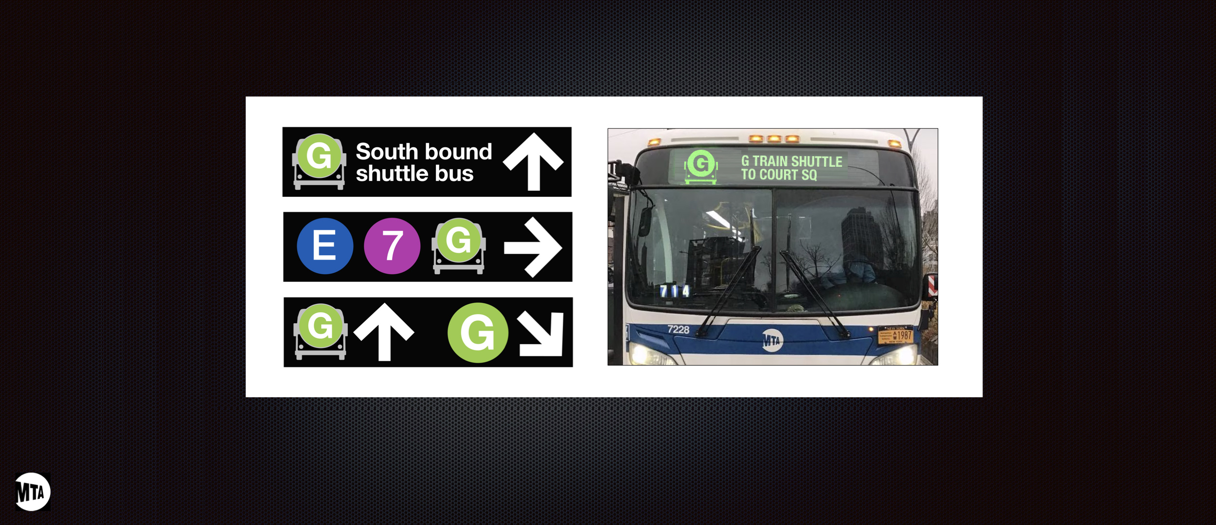
SHUTTLE BUS RE-BRANDING
By creating a icon-based brand that relates to the familiar train line, riders can easily relate to, and locate, the new shuttle bus locations. Ideal in the crowded, hectic environment of the NYC subway.
REBRANDING IN ACTION
Icon easily adapts to existing use of the G train icon; allows for easy application over existing signs
Icon adapts to existing App usage with minimal effort
New Shuttle Bus icon stands out from other bus lines; reducing confusion
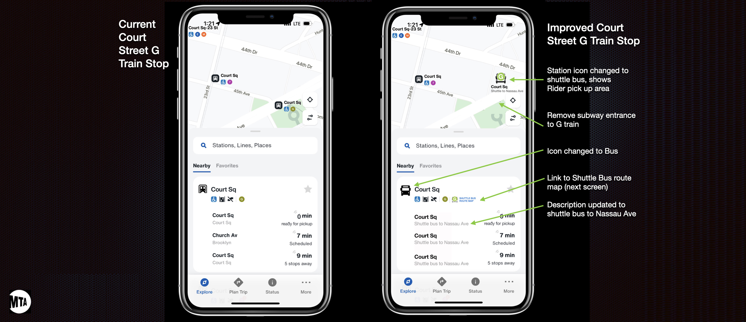
SHUTTLE BUS TRACKER APP
This is a new freestanding component of our widely used MTA app. This offers a new way to visually locate active G train shuttle buses at any given time; relative to to a rider’s location.
The app also includes estimated travel and arrival times; critical for when traffic or bridge openings can wreak havoc on a commute. This allows riders to seek alternative routes if the wait time exceeds an alternative route time.
The shuttle bus tracker achieves:
– An increase in confidence that a bus is nearby; critical in crowded environments where riders can not see buses in the distance.
– Gives riders a simple graphical map of the route stops; reassuring the replication of the G train route.
– Shows the MTA as being transparent in the arrival times of shuttle buses, along with empathy for the users to acknowledge delays.
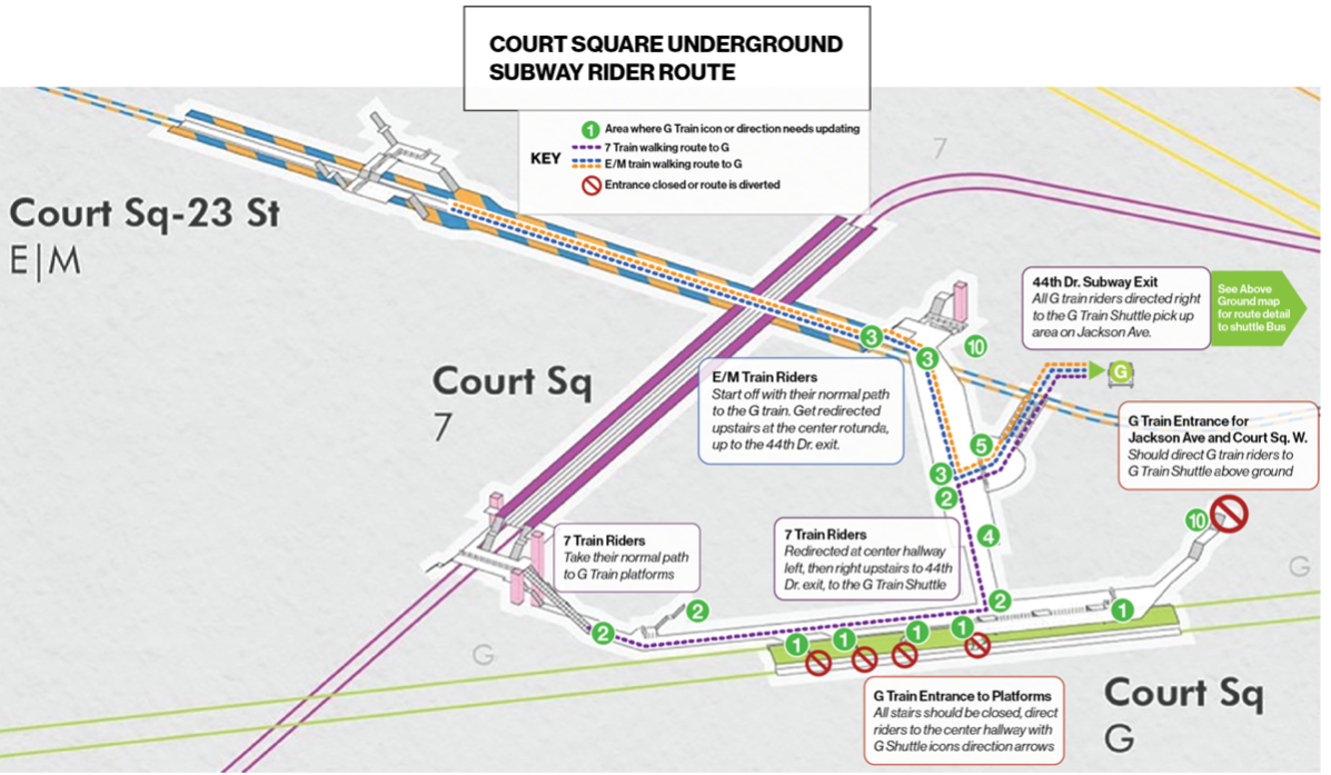
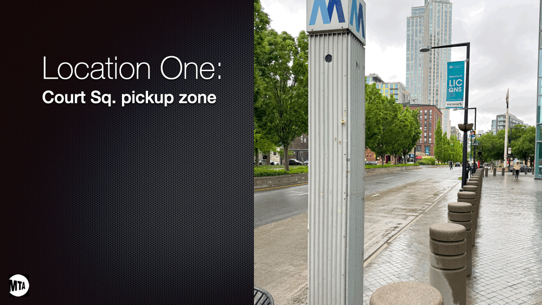
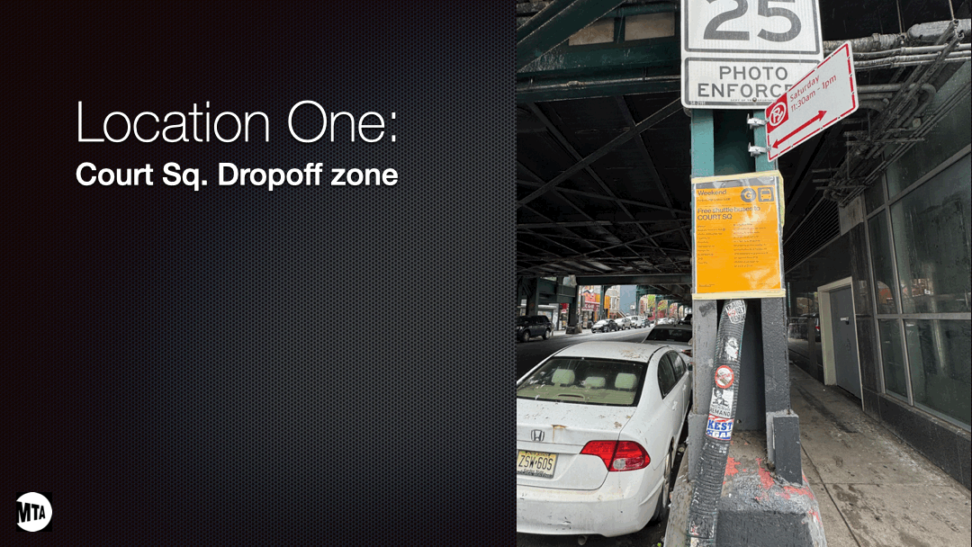
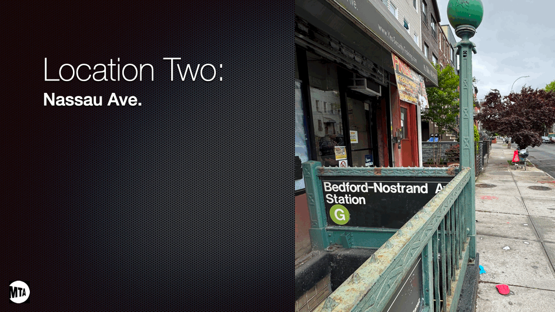
RIDER'S PHYSICAL UX
With the tools in place, the next big challenge was how to implement them. The shuttle bus area is crowded, complex, and involves changes to people’s daily commutes. Our goal was to address all points of direction in and out of the G train areas of the Court Street station complex with signage and route directions. Sizes/placement of overlay icons, new signage, and other markers needed to be mapped out for the optimal rider transition from subway to the shuttle bus.
Below are some key diagrams we developed to map out the challenges of altering the paths of 10,000+ rail commuters at Court St. station:
Physical user experience improvements: Before/After
Positive Outcomes
– Shuttle Bus brand system is easily adaptable to other train lines, allowing a full roll to any of our lines (in physical signage and with current MTA digital mapping)
– Riders get a system that works on their subway line familiarity; reducing stress while building confidence with the new shuttle system
– Implementation can easily work with existing signage; quick/low-cost roll-outs
– Bus Tracker app offers a power tool that builds trust and transparency with the shuttle bus; giving riders what they want